|
4. Design and Usability for the Web |
twinIsles.dev >> Photography on the Web
|
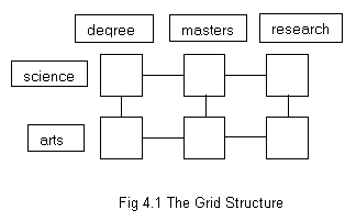
4.1 Designing for Usability A user performing a search is usually presented with a lengthy list of links, all potentially meeting their criteria. Opening one that leads to a confusing or frustrating interface will simply cause them to move on to the next. This section discusses a number of issues to be considered when designing for the web. 4.2 Human Centred Design Norman is an advocate of what he describes as "human-centered product development". In his book The Invisible Computer [77] he defines it thus: "It's a process of product development that starts with users and their needs rather than with technology. The goal is a technology that serves the user, where the technology fits the task and the complexity is that of the task, not of the tool." Norman [78] defines two fundamental principles of designing for understandability and usability: "(1) provide a good conceptual model and (2) make things visible". Users develop a mental model of a system from observing and interacting with it i.e. from what Norman calls the "system image". An accurate model allows them to correctly predict the future behaviour of the system, but the only means by which the designer can convey this model to the user is through the system image. Valuable information is given by the affordances of visible components. The affordances of an object are the things which may be done to it (e.g. a door may be pushed, a knob turned etc). Norman believes that what is important is "perceived performance", i.e. the actions that the user perceives are possible. He writes "the art of the designer is to ensure that the desired, relevant actions are readily perceivable" [75]. A system (e.g. web page) must not only possess useful functionality it must also make it clear to the user how to access that functionality. In the case of a web page clickable objects may be represented by graphics resembling raised buttons. Usability is enhanced by the use of appropriate mappings, i.e. the relationship of the controls to the actions they produce. The conceptual model of a system is further suggested by its constraints, i.e. that which it is impossible to do. If an option is unavailable at a particular point the user should not be able to select it. In order to maintain consistency within a web site unavailable options may be displayed in an inactive ("grayed-out") form. Visibility refers to that which may be readily observed about a system. This includes information about the current system state, actions available to the user and confirmation that the system has responded to the most recent user command; see also 4.5 Feedback. Norman [78] provides modern telephone systems as an example of poor visibility impacting on usability. These systems offer many facilities such as diverting calls, conferencing, callback etc., but these functions are often accessed by seemingly arbitrary key combinations. He suggests they could be improved by the incorporation of a small LCD display, or even auditory assistance, providing the user with a menu of options. Norman considers that usability is harmed by excessive, as well as insufficient, visibility citing the numerous controls found on many modern audio devices as an example of the former. Norman uses the car as an example of a complex but highly usable interface. He states that "the relationships among the user's intentions, the required actions, and the results are sensible, nonarbitrary, and meaningful". Despite having a multitude of controls most are related to a single function and make use of natural mappings, e.g. turning the steering wheel causes the car to move in the same direction. Jakob Nielsen, Norman's partner in the Nielsen Norman Group consultancy, echoes Norman's philosophy. Nielsen writes "Design complexity is a barrier for users. While they certainly might be capable of jumping the barrier, why should they? The Web is about freedom of movement. Anything that stands in the way of immediate task completion will negatively impact the user's experience" [72]. It is pertinent to note that the report of the Cullen Inquiry [46] into the 1999 Ladbroke Grove train crash (published during the production of this report) had considerably more criticism for the railway system than for the driver who passed a red signal thus supporting Norman's assertion that technology should be adapted for the benefit of humans and not vice versa. 4.3 Structure Sequences may be used to provide guided tours for new and novice users and also for online training presentations. Links are kept to a minimum and may be restricted to next, previous and home. Grids provide an effective way of correlating variables. For example a university web site may have departments of science, computing, arts and humanities. Each department may offer pre-degree, degree, masters and research programmes.
Lynch and Horton recommend that grids are most effectively used with "experienced audiences with some understanding of the topic and its logical organization". They further recommend the use of graphic overview maps with sites of this structure. Hierarchies are commonly used for web site structure with a home page linking to a number of sub-category main pages each of which may point to its own sub-categories and so on, to the required depth. It is not uncommon for large corporations or institutions, e.g. IBM [47], to have a number of subsites, each with its own identity but also having some commonality with the main site. Hierarchies may be classified as being of deep or shallow structure. Deep structures have many levels, but with relatively few choices available from each. Shallow structures offer a large number of choices from each menu page with fewer levels of depth. Webs attempt to mimic the human memory's associations between concepts and as such any page may be linked to from any other. The concept was first conceived by Vannevar Bush in his memex system described by Dix et al [21, p153]. Lynch and Horton recommend that webs "work best for small sites dominated by lists of links and for sites aimed at highly educated or experienced users looking for further education or enrichment and not for a basic understanding of a topic. One reason why sites built around the web structure may appear confusing is that the mental associations of the developer may be very different to those of the audience.
4.4 Navigation Nielsen believes that navigation is overdone on many sites. It is not necessary to provide links from every page to every other page, and doing so serves only to obscure the most useful links. Those which should appear include the site home page, section home page and search (which may be a link or an actual search box). Nielsen recommends providing links to all levels of the hierarchy above the current page, a feature incorporated to great effect by Yahoo [98]. He also advocates including links relevant to the current content, e.g. an article would include a link to the author's biography, a page on an e-commerce site dedicated to flatbed scanners would include a link to the page on film scanners. Consistency is essential in navigational design. Navigational elements should be placed in the same location on every page and should have the same appearance. Furthermore, the design should be consistent with platform conventions, e.g. a picture of a floppy disk should save data. Users are familiar with default settings (e.g. blue underlined text for links, purple for visited links etc.) and these should be adhered to unless there is good reason to do otherwise. The document Art and the Zen of Web Sites [5] contains the following quotation on this subject, "If you really believe that it's okay to change the meaning of interface elements, then it's a good thing you're designing web pages and not airplane cockpits." Regardless of a web site's design structure, the nature of hypertext means that visitors can enter a site at any page. Unlike print media it cannot be assumed that users will have seen the front cover or table of contents. It is therefore prudent to repeat basic site information on every page. Lynch and Horton [62, p13] recommend that these features include an informative title, the creator's identity and a creation or revision date. 4.5 Feedback In its online book "Macintosh Human Interface Guidelines" [4] Apple Computer, Inc. states "Keep users informed about what's happening with your product. Provide feedback as they do tasks and make that feedback as immediate as possible". Summarizing the rule for giving feedback Renaud and Cooper [88] write "Always provide feedback, for every action, and make sure it is completely unambiguous and informative". Fleming [38, p17] identifies two types of feedback; "responsive controls" and "information about location". She states "both types of feedback are essential to users since both help them judge their success or failure in moving through a site" Feedback is often appropriate when the user rolls the cursor over a clickable object, it may take the form of the cursor changing shape, the object's image being swapped for another, an informative message being displayed in the browser's status bar and further explanation appearing in the form of a tooltip if no user action occurs for a second or two. These effects may be achieved with JavaScript (see 5.3.1). Feedback should also be given when the system is performing some background task. In the case of the web this most often means downloading media intensive content. The user should be informed that the page is loading and where possible be given an indication of how much longer the process will take. In the case of large Flash movies it is possible to load and run a smaller movie (preloader) while the main one is being downloaded. 4.6 The Importance of Initial Impact The home page of a site should download quickly and provide a clear and concise guide to the site's content as well as grabbing the user's attention and encouraging further exploration. A splash screen is sometimes presented to the user before the main home page. Typically employing animation and being restricted in interactive capability its purpose is to catch the casual visitor's eye and entice them within. A splash screen can provide an attractive shop window but lengthy download times should be avoided if users are not to leave before they've even entered. 4.7 Information Chunking Where a long document is displayed as a single web page, intelligent use should be made of local links, e.g. links back to the top of the document should be placed at intervals of no more than a couple of screenfuls. Where it is likely that a sequence of information chunks will be printed a printer friendly version comprising the entire sequence should be provided. This version should have black text upon a white background, be no more than 535 pixels in width [62, p58] and include identifying information such as title, author, url, date last updated and copyright details. 4.8 Typography on the Web Initially web designers were forced to accept that their work would be displayed in whatever font was set as default on the user's browser. The introduction of Cascading Style Sheets gave greater control over how a web page would be displayed, but if the author specified a font which was not available on the user's browser it would simply revert to default. However CSS does allow developers to specify a list of preferred fonts. which the browser will attempt to display in order of first to last. If the list ends with either serif or sans-serif the developer may rest assured that the font used will at least belong to the appropriate category. Serif fonts e.g. Times New Roman have small tails on the edges of the characters which make for greater readability with printed text. However opinion is divided over whether this also applies to the computer screen. Lynch and Horton [62, p88] believe it does, writing "We generally set our text-laden Web pages in Times New Roman…". However other commentators disagree; Scribe Consulting [89] states that because of the lower resolution of the computer monitor compared to the printed page "small on-screen text … may be better in a sans-serif font like Verdana". 4.9 Reassurance Secure web sites are indicated to users of Microsoft Internet Explorer by means of a padlock icon at the bottom of the browser window, but it is likely that many users will not understand this symbology or even be aware of its existence. Fleming [38, p107] quotes the example of FAO Schwarz which incorporates the simple, but reassuring message "shopping at FAO is easy and secure". It is beneficial to provide a clear and concise description in plain language outlining the measures that have been taken to safeguard the security of users' financial and other confidential information. Where personal data is requested the site should publish a privacy policy, clearly informing users as to why the information is required and what it will be used for. The information requested should not be excessive for its purpose and failure to provide information should not provide an unnecessary obstacle to further exploration of the site. Users should be permitted to (easily) remove personal details such as credit card numbers from the site's database, e.g. following receipt of goods ordered, should they wish to do so. 4.10 The Avoidance of Barriers A number of the sites analysed in 3.2 offer a registration feature whereby a user can set up an account with the site. Such a feature helps encourage repeat visits by creating a bond with registered users. Users may be encouraged to register by being offered a bonus that is not otherwise available, e.g. Corbis's free screensavers or gettyone.com's non-watermarked "comp" images. However the policy of preventing non-registered users from accessing the main features of the site, as happens with TimePix, would appear to be counterproductive in the sense that potential users are deterred. Surveys are a common means of gathering data about a site's visitors. However, the placement of such a survey must be carefully planned if it is not to act as a deterrent to further exploration. Fleming [38] quotes an example of an online store which requires customers to complete a questionnaire before they can make a purchase. This would be more effectively placed after the checkout. 4.11 The use of Multimedia Elements
Rather than forcing the user to endure a lengthy download only to discover
that the material is not what they wanted or will not play on their platform,
multimedia should be offered as an option. Before choosing to download
the user should be provided with a description of the content, details
of requirements such as plug-ins and the size of the file and/or an estimate
of download time for a given connection. |